Plotting and Visualization
All sampler interfaces in discoverysamplers provide consistent plotting methods for visualizing results. The plotting functions are implemented in the plots module and wrapped by each interface.
Available Plots
Method |
Description |
|---|---|
|
Trace plots showing parameter evolution over samples |
|
Corner plots with marginal distributions and correlations |
|
Model dimension posterior (RJMCMC only) |
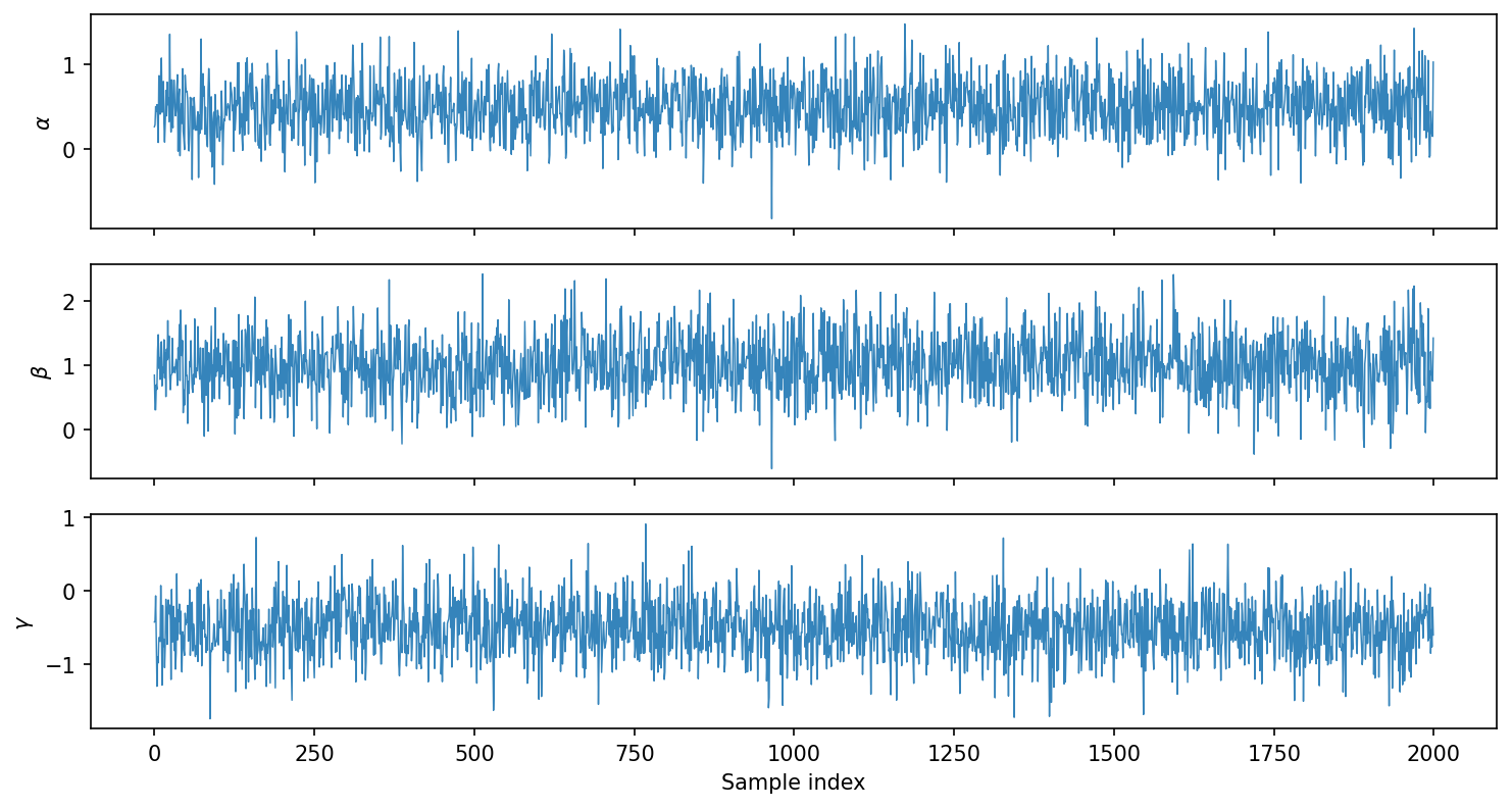
Trace Plots
Trace plots show parameter values as a function of sample index, useful for checking convergence and mixing.
Nested Sampling (Nessai, JAX-NS):
# Run sampler
bridge = DiscoveryNessaiBridge(model, priors)
bridge.run_sampler(nlive=1000)

# Plot traces
fig = bridge.plot_trace()
fig.savefig('trace.pdf')
MCMC (Eryn):
For MCMC samplers with parallel tempering, trace plots show all temperatures with different colors:
# Run sampler with parallel tempering
bridge = DiscoveryErynBridge(model, priors)
bridge.create_sampler(nwalkers=32, tempering_kwargs=dict(ntemps=4))
bridge.run_sampler(nsteps=5000)

# Plot traces (discarding burn-in)
fig = bridge.plot_trace(burn=1000)
fig.savefig('trace_mcmc.pdf')
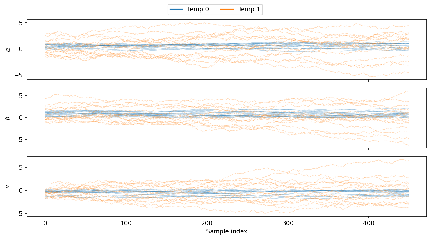
Options:
burn: Number of initial samples to discardplot_fixed: Include fixed parameters (shown as horizontal lines)
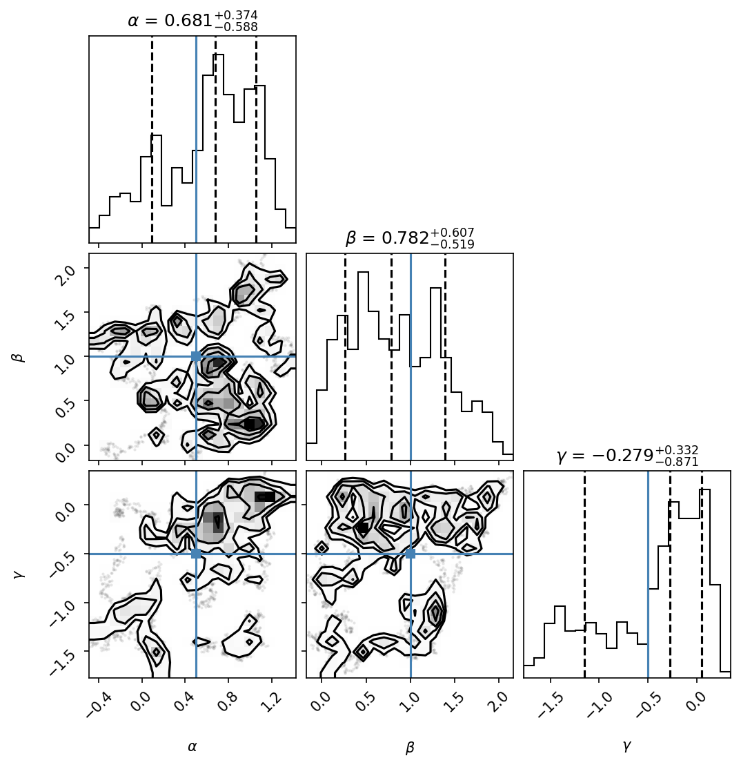
Corner Plots
Corner plots show 1D marginal distributions on the diagonal and 2D projections off-diagonal:
# Basic corner plot
fig = bridge.plot_corner(burn=1000)
fig.savefig('corner.pdf')

# With true values and quantiles
fig = bridge.plot_corner(
    burn=1000,
    truths=[0.5, 1.0, -0.5],      # Mark true values
    quantiles=[0.16, 0.5, 0.84],   # Show 68% CI
)
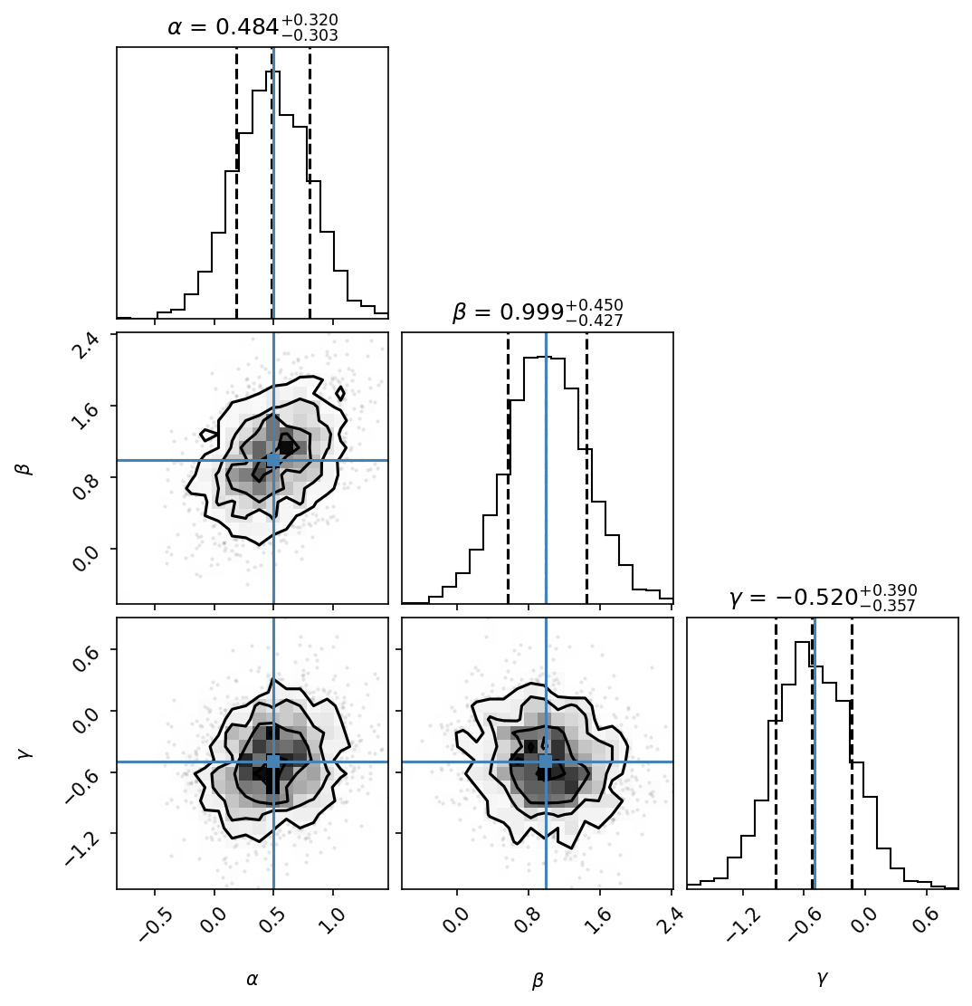
For MCMC with temperatures, specify which temperature chain to plot:
# Cold chain (temperature 0, the target posterior)
fig = bridge.plot_corner(burn=1000, temp=0)
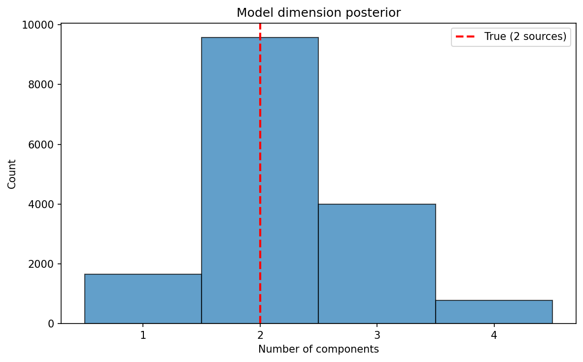
Model Selection (RJMCMC)
For reversible-jump MCMC, plot the posterior on the number of components:
from discoverysamplers.eryn_RJ_interface import DiscoveryErynRJBridge

# After running RJMCMC
fig = rj_bridge.plot_nleaves_histogram()
fig.savefig('nleaves.pdf')

# With true value marked
from discoverysamplers.plots import plot_nleaves_histogram
nleaves = rj_bridge.return_nleaves()
fig = plot_nleaves_histogram(
    nleaves,
    nleaves_min=1,
    nleaves_max=5,
    true_nleaves=2,
)
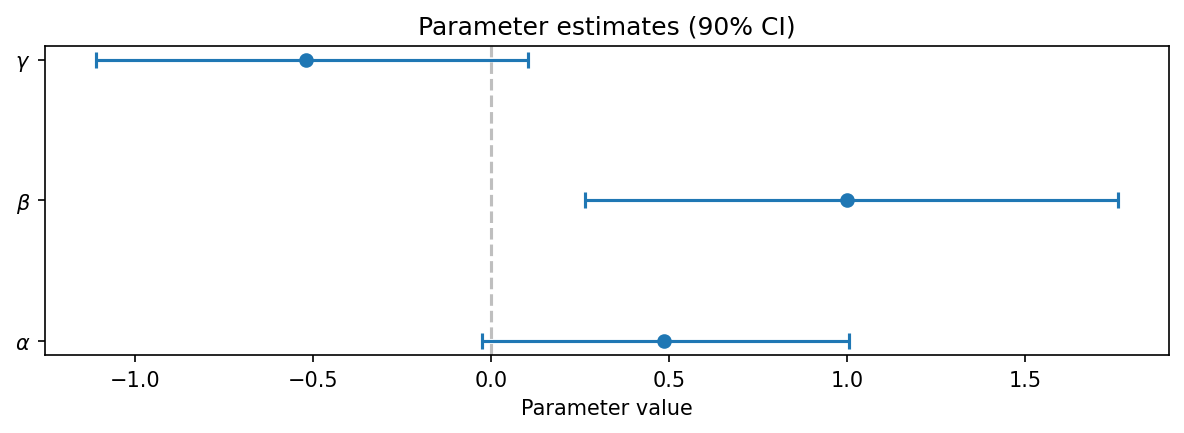
Parameter Summary
For a quick overview of parameter estimates with credible intervals:
from discoverysamplers.plots import plot_parameter_summary

samples = bridge.return_sampled_samples()
fig = plot_parameter_summary(samples, credible_interval=0.9)
fig.savefig('summary.pdf')
Using the Plots Module Directly
You can use the plotting functions directly for more control:
from discoverysamplers.plots import plot_trace, plot_corner

# Get samples in standard format
samples = bridge.return_sampled_samples()
# Returns: {'names': [...], 'labels': [...], 'chain': ndarray}

# Create custom plots
fig = plot_trace(
    samples,
    burn=500,
    figsize=(12, 8),
    alpha=0.5,
)

fig = plot_corner(
    samples,
    truths=[0.5, 1.0],
    show_titles=True,
    title_fmt=".2f",
)
Saving Plots
All plotting methods return matplotlib Figure objects:
fig = bridge.plot_corner()

# Save as PDF (vector, publication quality)
fig.savefig('corner.pdf', bbox_inches='tight')

# Save as PNG (raster, for presentations)
fig.savefig('corner.png', dpi=300, bbox_inches='tight')

# Close figure to free memory
import matplotlib.pyplot as plt
plt.close(fig)
Customization with corner
The plot_corner method passes additional keyword arguments to corner.corner():
fig = bridge.plot_corner(
    burn=1000,
    # corner.corner options:
    bins=30,
    smooth=1.0,
    color='C0',
    fill_contours=True,
    levels=[0.68, 0.95],
    plot_datapoints=False,
)
See the corner documentation for all options.
See Also
Eryn MCMC Sampler - MCMC sampling with Eryn
Nessai Nested Sampler - Nested sampling with Nessai
Reversible-Jump MCMC - RJMCMC for model selection
Plotting Module - API reference for plotting functions